What is being worked on?
Testaluna, our partner company, have recently been working to harmonise the human-computer interaction (HCI) within the intelligent learning support platform.
This work is directed at developing an intuitive interaction interface for primary mathematics, and to create visual coherence of the various user-facing components of the system.
To give you a bit of behind-the-scenes action, iTalk2Learn interviewed Paolo Daolio, the content director of Testaluna – a company dedicated to the creation and development of educational and informative video games, simulations, 2D and 3D virtual environments.
What are the main steps and the basics to be considered when it comes to the harmonisation of GUIs and usability?
Generally, and also in this specific case, our work starts with collecting requirements to get to a better understanding of the envisaged UIs and means of interaction with the platform.
At a later stage we investigate, from a technical standpoint, the affordances of the underlying technologies. This is in order to define a strategy capable to allow different teams to work both on the development of the platform and the GUIs in a separate but parallel way. This is a crucial tread in collaborative projects, as in this case.
Only at this point, after having collected all of this information, we turn to generate a certain number of GUIs proposals.
Afterwards it’s up to the consortium to analyse and select the propositions that we presented.
What are the characteristic aspects on which you have focused for the realisation of the design?
When designing the graphical proposal we focused on the three following aspects:
1) The conceptual cage
The conceptual cage (layout) is a mere non-graphical, informational layout, which summarises the content and navigation items. It represents the fundamental layout, by which contents are sketched in specific areas, providing users with a reading order.
2) The navigation
The navigation leads the user through the pages of the platform, answering all the fundamental questions that could arise during the visit, such as:
- Where am I?
- Where have I been?
- Where can I go?
The conceptual cage, if properly structured, is a huge contributor to answering these questions alone.
A recognisable and consistent navigation guides users to a proper and immediate view of the contents of the platform.
3) The terminology and hierarchy of the titling
The terminology and hierarchy of the titling has to be consistent with the linguistic style throughout the platform. Therefore, if a page is named “WoZ” it should always be indicated with the same name, and all the related buttons/links should bear the same name (e.g. Back to WoZ, Go to WoZ , Welcome to WoZ etc.).
After these interesting insights, we are curious to have a sneak-peek into the design of the presented proposals…
I cannot reveal everything in advance, but I can give some more general details on the choices that have been made!
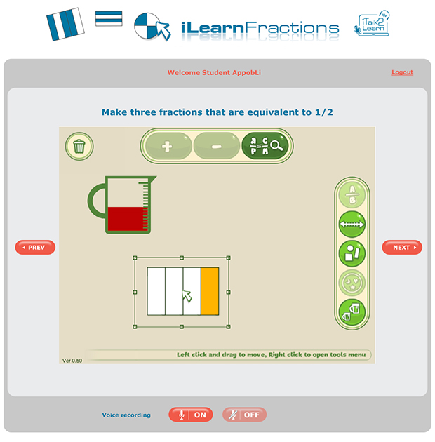
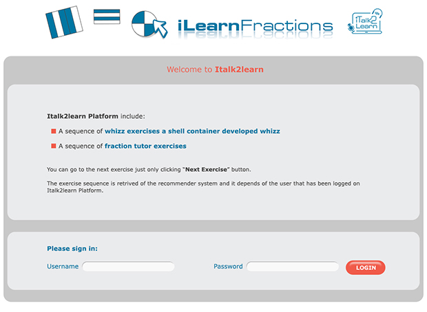
The platform consists of three types of pages through which users can interact with the system at different levels. The graphical proposals are of course a consequence of the considerations illustrated so far and take inspiration from the look & feel of the iTalk2Learn logo.
The four graphical solutions have different characteristics, which in a nutshell are:
- PROPOSAL A. Clean and linear graphics – standard and professional appeal.
- PROPOSAL B. Panels and buttons with soft curved lines, offering a touch of colour to the navigation
- PROPOSAL C. In this version a graphic element is included, featuring the coloured zigzag line. This lightens the tone and provides a more playful appeal.
- PROPOSAL D. In this version the zigzag element, that we introduced in proposal C, has the same colour of the iTalk2Learn logo.
A big thank you to Paolo for his time – we can’t wait to see the designs! Take a look at Testaluna’s website to find out more about what they do.
Please comment below with your opinions on the proposals and with any ideas on how an interactive interface for primary mathematics can be developed further.
Editor’s note
Partners have recently decided to adopt Proposal B.


